One thing I have not been quiet about is that I really didn’t want to build a new house. I’ve always preferred beautiful – albeit – questionably, old homes. There is something special about those creaky old floors and nooks and crannies, new homes are missing. Still my fiancé was adamant that underneath those creaky old floors is often headaches that can leave your savings drained. So rather than find a fixer upper, we decided to design and build traditional home design into a new house. Here are a few five places we focused on with our architect (aka my Daddy-o!) to make our new home feel old.
Tall Windows
A huge part of our budget went to windows. Not because we went with the high-end choice (in fact we went with a middle of the road option) but because we had the majority of our windows be over 5 feet tall. We also opted for three sets of french doors, i.e. floor to almost ceiling of windows.
Traditional windows were typically tall single- or double- hung. Unfortunately, what these windows provide in nostalgia they lack in efficiency. We simply gave the look of single hung windows while they are actually encasement windows that provide much better efficiency for modern day living.
Wall Treatments
Adding a couple of wall treatments really helped add some traditional home design details to our new build! (Bonus: they are so budget friendly.) We added this dark green wainscoting to our guest bathroom to add a classic design element and a bit of drama. The full bathroom reveal is coming – promise!

Ornate Trim
This is probably the smallest detail, that made the biggest impact. And unfortunately, it’s not an easy DIY.
I’m lucky enough that my soon-to-be father-in-law was a talented carpenter before he was a contractor and designed our trim headers. He created the custom headers with a router bit that is very similar to the ‘Cove and Bead’ router here. However, this is definitely a tool that should only be used by someone with experience.
We did try to keep the trim fairly simple since at the beginning we weren’t sure if we would have an expert carpenter skills. Our ornate header can actually be emulated with pieces found in any Home Depot – plus a lot of caulk!
A little Imperfection
Oh, yes. I can quite literally hear my fiancé shuddering at this notion. But I really do think what makes older homes so charming is that not everything is perfect about them. In fact, sometimes the spaces are downright wonky. Whether that is due to the limitations of the time or to a poor foresight mid project, I think it’s the spaces that are a little imperfect that make a lasting impression and open the door for creativity.
More than one person has walked into our master bathroom and asked – what’s the point of the shelf?
Aside from the perfect plant spot, truthfully, not a dang thing.
Within the first two minutes of seeing the walls up in our bathroom I knew exactly that this little wrap around shelf would make for a beautiful transition for our half wall with the shower. Plus, give me a little bit of imperfection I crave.

Simple and Symmetrical
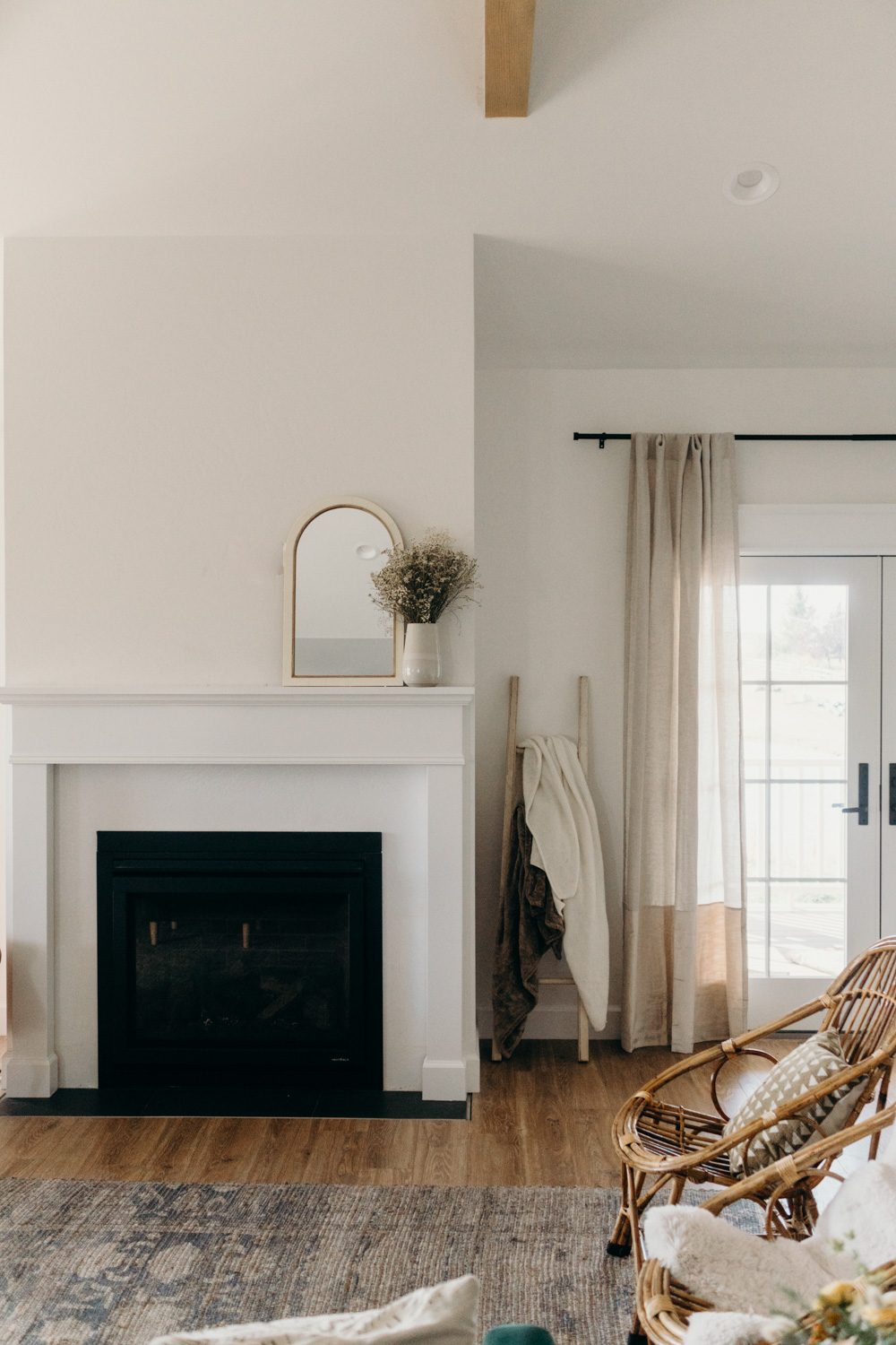
At the very beginning of the design process we expressed that we wanted our house to feel welcoming. We wanted people to walk in and feel immediately warm. Turns out simple shapes and a bit of symmetry is all you need to add a bit of nostalgia to a space. (And a fireplace sure doesn’t hurt!)
To keep our home from feeling grand we made sure to keep the fireplace off the gable and surrounded by a bit of simple symmetry. The tall ceilings coming to a point is a beautiful way to pull focus, but we wanted the house to feel more homey than grand. (This house is beautiful, but ultimately felt too grand for what we envisioned for our space.)

A few other details that helped our new build feel more traditional:
- furniture like vanities in the bathrooms
- ceiling medallions
- an ornate kitchen hood
- vintage hardware


5 Ways to Incorporate Traditional Home Design into a New Build
VIEW THE COMMENTS