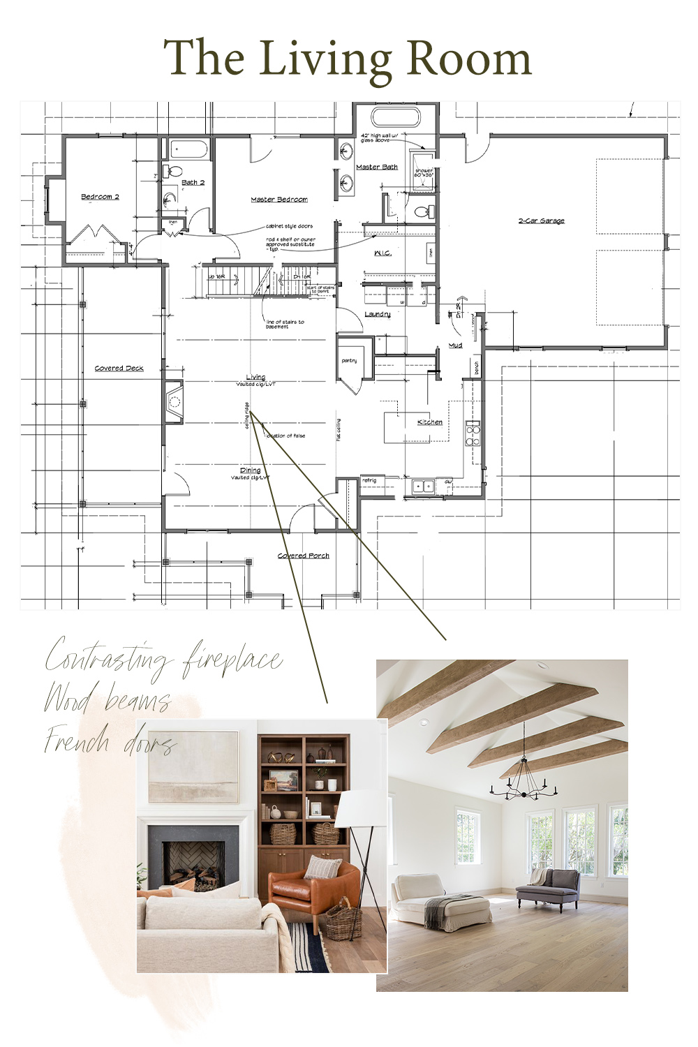
We are now four months into building our house and it’s finally starting to feel real enough that I can share a few of our designs! I’d be lying if I told you I only recently started dreaming of the interior design. (I believe I started planning on Day 2.) But the details are getting more and more hammered out so I figured I can share our designs without looking like an entirely different house in the end.
Before we started building our home I was completely convinced of renovating an older home. However, when the opportunity came up for us to build on some family land, we couldn’t really say no. So rather than rebuilding an older home, we are creating a new home with all the touches of old world style that I love.
The Living Room
When we first started designing our home, my fiancé and I were pretty adamant that we wanted our home to feel cozy rather than grand. We wanted ourselves and anyone who walked through the front door to feel welcomed right away. That being said we made it so when you open the front door one of the first things you see is our fireplace.
I also love the Old World style, so we had my dad (who was our architect!) place two french door sets around the fireplace. And rather than the traditional beams you often see here in Montana, I wanted something a little bit different. Our beams will run perpendicular to the gable rather than flush on the ceiling.

Bathrooms
As of now we are planning on only finishing the main floor bathrooms and for those I wanted to do two entirely different styles (without straying too far from our Old World style, of course)!

For our bathroom I wanted to keep it as serene as possible. We found a beautiful white cottage tile from our local tile company, Onyx, that has a lot of color variation in each tile. And so it doesn’t feel too disconnected from the rest of the house we wanted to use this traditional-esque vanity. (Down the road I’m hoping to wallpaper our toilet room with this beautiful hand stamped wallpaper!)
Our guest bathroom might have not have any windows but I didn’t keep that from letting me work some moody color in! I found this green moody bathroom from Jenna Sue Design on one of my many Pinterest scrolls. We’ll be making it our own with a custom mosaic tile pattern.
Kitchen
Oof! This is the one design plan I hesitated sharing. We have our idea of our kitchen design and we know our budget might allow an entirely different one.

So for now I’ll just say that we wanted our kitchen to have greige cabinets with the ever popular zellige tile look. (Zellige tiles give a beautiful depth of texture and character with their imperfect edges. They unfortunately start around $30/square foot and require an entirely different installation technique vs ceramic.) We already know our budget can’t afford true zellige tiles so thankfully there is a beautiful faux option that doesn’t break the budget!
If you follow me on Instagram you might remember the black vs white countertop poll and if so you’ll either be very disappointed or intrigued that we are going with… black countertops! We’ve heard lots of advice about our decision, but ultimately I couldn’t handle the thought of staining white countertops. (I’m just too clumsy and I like red wine too much.)
To help keep all of our designs + ideas in one space I’ve have been using Milanote! I actually have been using this program for years to help me organize photoshoots with businesses, but truthfully it works great for ANY kind of project. The best way to explain it is like a completely customizable Pinterest board that let’s you upload and store files. It’s also borderline as addicting as Pinterest. You’ve been warned!

We are hoping to move in by the beginning of June, so we have quite the road ahead of us. If you want to follow along with all of our house building adventures, I *try* to do a weekly recap over on Instagram.


A Quick Tour of Our Old World Style House
VIEW THE COMMENTS